Panels
As mentioned in the Overview, EasyMaker3D uses some more conventional 2D user interface panels. Because these panels need to work in VR as well as in conventional mode, they appear in the 3D work area. Panels are always aligned with the XZ-plane.
Panels are divided into three categories:
Application panels implement various application functions, such as loading sessions or modifying program settings. Application panels appear initially in a central location.
Tool panels are used for certain specialized tools. A tool panel appears initially above the primary selection it is operating on.
The Tree Panel is special; it is always fixed to the back wall and has its own section in this guide.
Moving and Resizing Panels
Panels are placed initially to be reasonably easy to interact with. When application panels are visible, they temporarily hide the scene contents so there is no interference. (Tool panels do not do this because you may need to see the results of editing models with them.)
When activated, tool panels appear near the primary selection so you can see their effects. Application panels, on the other hand, are positioned to be visible in the current view.
You can move any application or tool panel if it is in an inconvenient place. All panels have interactive handles on the center of each edge that can be dragged to move the panel to the left, right, up, or down. There is also a bar at the bottom that can be dragged to move the panel to the left, right, forward, or back. Each application and tool panel remembers its last position.
Some panels (such as the Settings Panel shown here) also have interactive spherical handles in the four corners that allow you to resize the panel. All panels have a minimum size and will not let you resize them smaller than that.
VR Only
All interactive panel handles respond to grip-dragging as well. The relative orientation of the grip hover guide on the controller determines which handle will be used. For example, if the guide for the right controller is close to parallel to the X axis, it will highlight the move handle on the right side so you can grip-drag it. If the panel has scale handles and the guide is close to the diagonal direction, it will highlight the corresponding scale handle.
You can interact with the contents of a panel (if it supports it) by pointing the grip hover guide towards the board. If the controller is low enough (relative to the panel), it will allow you to grip drag the bottom bar, as shown here.
Note that application panels in either VR mode are positioned for panel touch mode and therefore are not affected by the non-VR viewing position or orientation.
Interacting with Panel Elements
Each panel consists of interactive elements (buttons, dropdowns, etc.) that work pretty much the same as in conventional 2D user interfaces.
Disabled elements are dark gray.
All enabled elements highlight when hovered with the mouse or laser pointer.
Clicking on an element with the mouse or pinch action activates it.
Keyboard navigation between enabled elements uses the Tab and Shift-Tab keys. The element with the current keyboard focus is shown with a cyan border outline.
Pressing Enter on the keyboard activates the focused element.
Pressing the Escape key in any application panel always cancels whatever the current panel is doing and dismisses it.
Some panels contain scrolling areas when their contents are too large to fit. You can scroll a panel using a scroll wheel, the scrollbar on the right (drag with mouse or pinch), or the Up and Down arrow keys (or Up/Down trackpad/joystick buttons on a VR controller). The same is true for long dropdown lists.
VR Only
Panel touch mode is active when in either of the VR modes. In touch mode, a touch affordance is added to each controller model that acts as a virtual finger. Touching the tip of this affordance to a button, slider, or other element works as you would expect. The controller will vibrate briefly when this happens for feedback.
Most interactive elements also support clicking with the grip button. When the hover guide is close enough to perpendicular to the panel, it will highlight the element that it will interact with.
Application Panels
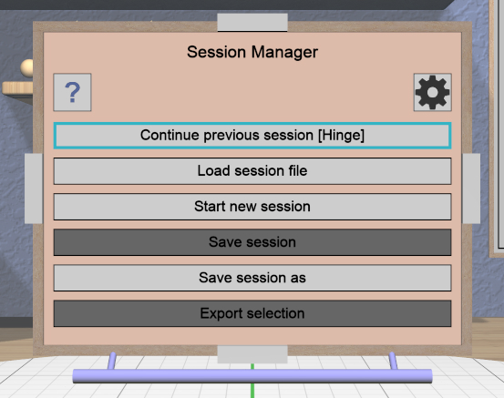
Session Panel
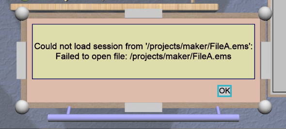
The Session Panel is shown when the application starts and can also
be brought up at any time with the Open Session Panel action. This panel is used to start, save, and load
sessions. Sessions are saved as text files with an
.ems extension.
The Session Panel has the following buttons:
Continue previous/current session. When the application starts, this choice will be enabled if your previous session was saved with a name, which will appear in brackets in the button text. Click this to resume working in that session. If the panel is invoked during a session, clicking this button will act as if nothing happened. If there was no previous session when the application starts, this button will sayNo previous sessionand will be disabled as in the image.
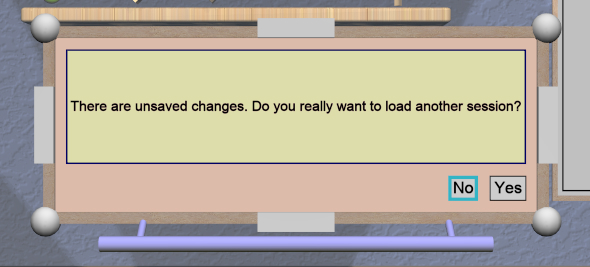
Load session file. This can be used to load a different session file using the File Panel; you will be asked if you made any changes to the current session that you might want to save.
Start new session. This resets everything to empty and starts a new, unnamed session. If you do this during a session, you will be asked if you made any changes that you might want to save.
Save session. If your session is already named, this will be enabled to save it again if you made any changes.
Save session as. This lets you save your session with a different name using the File Panel.
Export Selection. This lets you export the selected model(s) to a file, using a File Panel. The File Panel has a dropdown that allows you to select the desired format (text or binary STL).
Help(Question mark icon at top left). Opens the Help Panel. Dismissing the Help Panel returns to the Session Panel.
Settings(Gear icon at top right). Brings up the Settings Panel. Dismissing the Settings Panel returns to the Session Panel.
The default directories in which to find or save session files and STL files are both stored as user settings and can be modified with the Settings Panel.
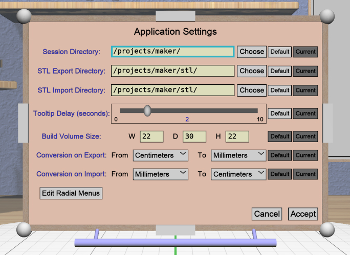
Settings Panel
The Settings Panel lets you modify application settings that are
saved between sessions. The location of the saved settings is
$HOME/.config/EasyMaker3D on Linux and Mac, and %APPDATA%\EasyMaker3D on
Windows.
Each item in this panel has two buttons to the right:
The
Defaultbutton resets the item to its default value.The
Currentbutton sets the item to its current (saved) value. You can use this if you accidentally change a value and want to undo that without having to cancel all other changes.
The Accept button at the bottom of the panel will be enabled if you make
any changes to the current settings. Clicking it applies the new settings and
saves them to the settings file. The Cancel button leaves all settings at
their previous values. Either button makes the panel go away. The
Escape key also cancels the panel.
The items in this panel are, from top down:
Default Directories: The first three settings are the default directories for saving and loading sessions, STL model export, and STL model import. Each of these has a text input field for the directory name and a
Browsebutton that opens a File Panel to choose a directory for that item.Tooltip Delay: This is a horizontal slider you can use to adjust the time it takes for tooltips to appear when hovering the mouse or laser pointer over an interactive object. Values are in seconds, from 0 at the left to 10 at the right. Setting this to 0 disables tooltips completely.
Build Volume Size: This consists of three text input fields for the width, depth, and height of the build volume, specified in the current units. You can set these to match the approximate size of your 3D printer’s build area for reference.
Unit Conversion: There are two pairs of dropdowns allowing conversion of units on model import and model export. The use of these settings are explained in more detail in the Overview.
Radial Menus: The last button brings up the Radial Menu Panel, which allows you to edit which buttons appear in radial menus.
Info Panel
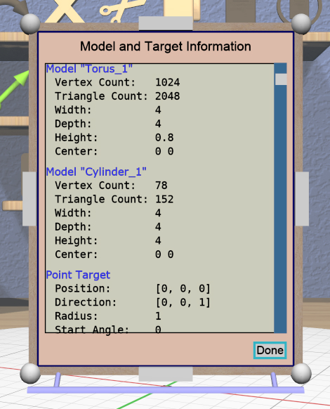
The Info Panel shows information about all selected models, including the number of vertices, number of triangles, size in all three dimensions, and the X/Y coordinates of the center of the model. If any model has an invalid mesh, this is noted, along with the reason it is considered invalid.
If either the Point or Edge Target is active, the relevant information about it will also be shown in the Info Panel.
The Info Panel is resizable using the corner handles. If the text does not all fit vertically in the info area, the thumb in the scroll bar will appear to let you scroll up and down.
The Done button or the Escape key closes the Info Panel.
Help Panel
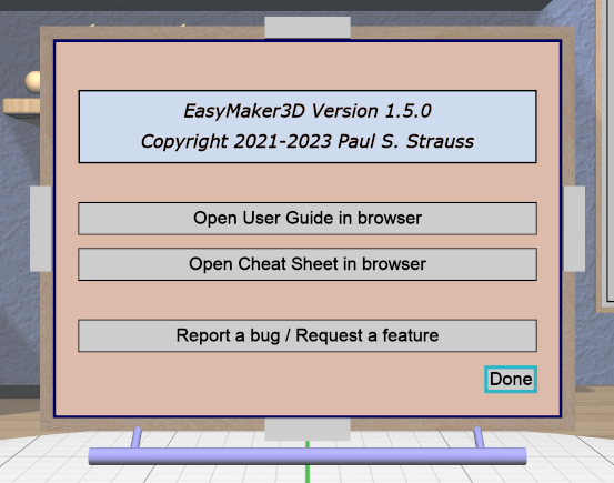
The Help Panel shows text with the current application version along with two buttons that open this User Guide and the Cheat Sheet in your default browser.
The Done button or the Escape key closes the Info Panel.
Radial Menu Panel
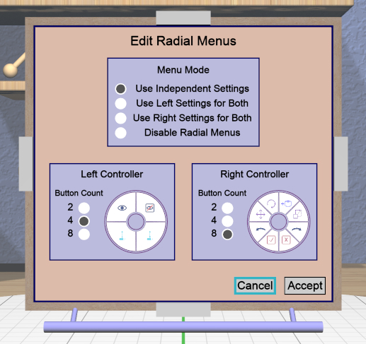
The Radial Menu Panel can be opened from the Settings Panel to let you edit which buttons appear in the left and right radial menus. The radio buttons in the box at the top let you choose one of the following options:
Use Independent Settings: Editing areas for both left and right menus appear to let you edit buttons for each side independently as shown in the image.
Use Left Settings for Both: Only the area for the left menu is shown; the buttons defined in there are used for both menus.
Use Right Settings for Both: Only the area for the right menu is shown; the buttons defined in there are used for both menus.
Disable Radial Menus: Both areas are hidden and radial menus are not available.
You can set the number of buttons to use in a radial menu to 2, 4, or 8. The
menu diagram updates to reflect the current number. Clicking on any button in
the diagram brings up the Action Panel that lets you
choose the action attached to that button. Each type of
action is represented by a horribly-designed 2D icon that is displayed in the
radial menu diagram and in the actual radial menu as well. The  null
icon is shown when no action is bound to a button. All actions and icons are
shown in the Cheat Sheet.
null
icon is shown when no action is bound to a button. All actions and icons are
shown in the Cheat Sheet.
Action Panel
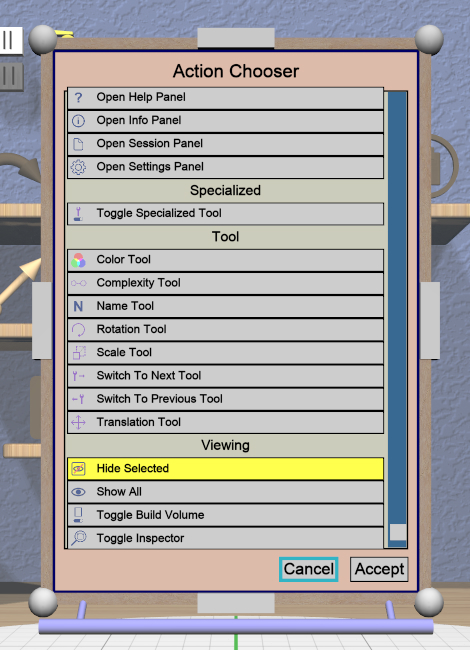
The Action Panel is used by the Radial Menu Panel to select the action attached to a radial menu button. It presents a scrolling list of actions to choose from, organized by category. The action that is currently bound to the button being modified is highlighted.
See the Cheat Sheet for a list of all actions and their associated icons.
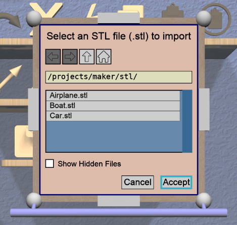
File Panel
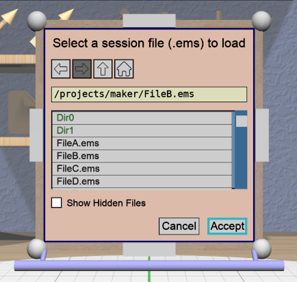
The File Panel is used by the Session Panel and the Settings Panel when a directory or file needs to be chosen. In addition, the Import Tool Panel is essentially a File Panel.
This panel works pretty much like a standard file browser. The four buttons at the top go to the previous directory (if any), the next directory (if you went to the previous one), one directory up, or your home directory. A button at the bottom lets you see (operating-system-specific) hidden files and directories.
The scrolling list is color coded for directories and files, with directories listed first.
When using a File Panel for exporting models, a File Format dropdown appears at the top right for selecting a format.
Dialog Panel
A Dialog Panel is used by other application panels to ask you a question or inform you of some other condition. A question dialog will have buttons with answer choices. A message dialog will just have one button to dismiss it.
Virtual Keyboard Panel
VR Only
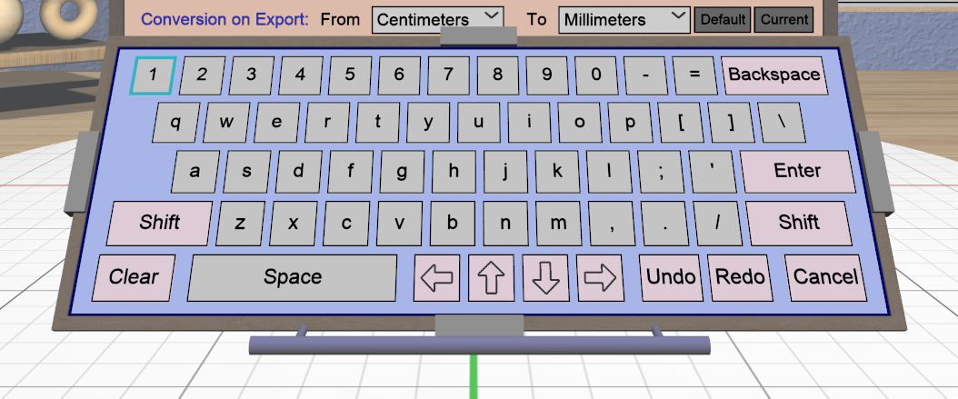
The Virtual Keyboard Panel is used only in full VR mode when you are wearing the VR headset and you need to edit text in a panel. It is most easily used by touching the keys with the touch affordance. (You can also use the laser pointer, but it is much more awkward.)
Tool Panels
Bevel Tool Panel
The Bevel Tool Panel lets you edit the bevel created for all Beveled models once they have been converted from other models. The bevel can be any sort of profile applied to model edges to create various effects such as chamfering or rounding.
All interactive changes made to a profile can be undone and redone individually.
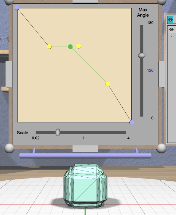
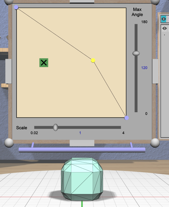
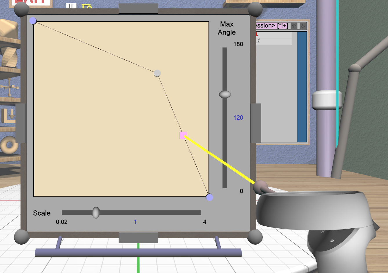
Profile Area

The large area in the panel shows the current profile of the primary selection and lets you edit it. If you make changes, they are applied to all selected Beveled models. The models update in real time as the profile is edited.
The profile is interpreted as follows:
The lower-left corner is where the edge is located, looking along its length.
The upper-left and lower-right points of the profile are at fixed locations and are colored blue to indicate this. You can add new points between them, move those points around, and delete points.
The default profile is just a line connecting the two fixed points, which creates a bevel for all edges as in this image.
Adding, Moving, and Deleting Points

If you move the mouse close to an existing profile line (but not near an existing point), a red square will appear to indicate that a new interior profile point can be created there as shown in the left image. Clicking in that spot will create a new point. Click-dragging lets you move the new point where you want.
Dragging an existing interior point moves it; when you do this, a box with an “X” in it appears to allow you to delete the point by dragging it over that box, as shown in the center image.
Modified-dragging a profile point will cause it to snap relative to its neighbor points. Snapping will occur if the dragged point is close to vertical, horizontal, or on a 45-degree diagonal from either or both neighbors. When this happens, the snapped segment(s) will be highlighted with a different color as in the right image above.
Profile Scaling
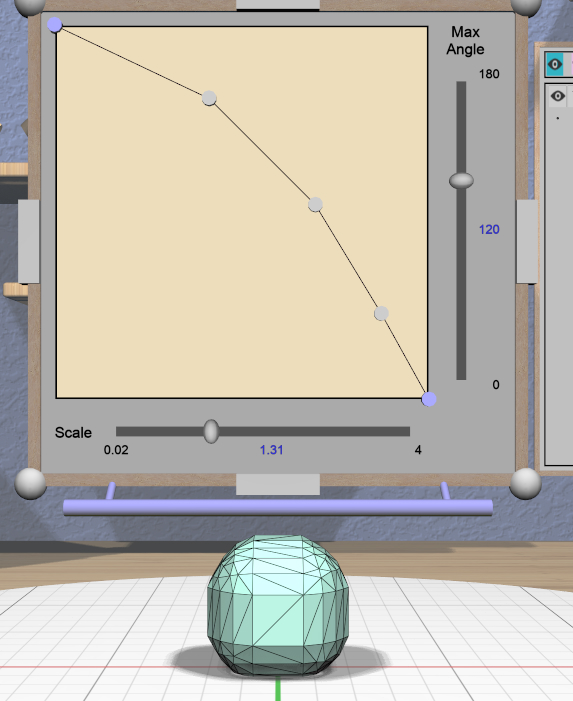
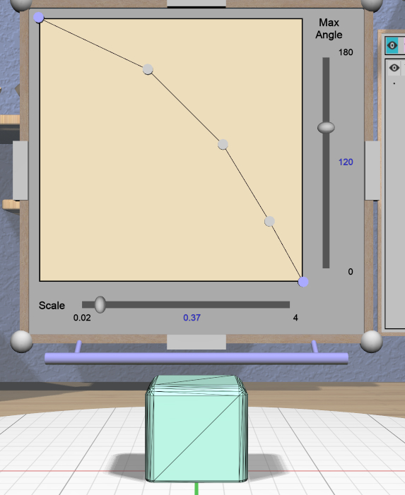
The slider at the bottom of the panel allows you to change the size of the profile as it is applied to edges without having to move any points. For example, you can create a rounding profile and change the radius by adjusting the slider as shown here. The value shown for the scale slider is defined as the distance of the new bevel edges from the original vertices, measured along the original edges.
Adjusting the Maximum Edge Angle
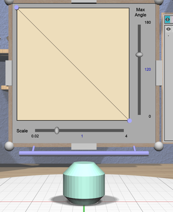
The slider on the right side of the panel allows you to change the maximum edge angle, from 0 to 180 degrees. This setting determines which edges of a model will have the bevel profile applied to them.
For example, suppose you want to bevel just the edges along the top and bottom faces of a cylinder, as shown here. These edges form 90 degree angles, so as long as the maximum angle is at least 90, they will have the bevel profile applied. The angles between faces forming the sides are typically greater than 90 degrees (unless the cylinder has very low complexity). As long as the maximum angle is smaller than that those edges will be left alone. The default is 120 degrees.
Grip Dragging
VR Only
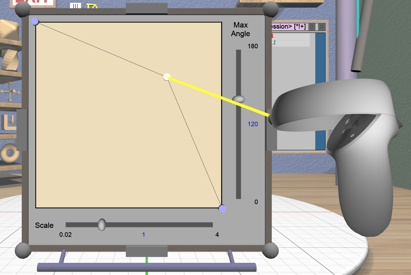
In either VR mode, you can use the laser pointer and pinch action to edit the profile and adjust the sliders in the panel. However, it is very hard to make fine adjustments this way. It is much easier to use touch mode interaction or grip-dragging. Touch mode interaction works as you would expect, where the touch affordance acts like the mouse; you can touch to drag existing points or near the midpoint of a profile segment to create and drag a new point.
Grip dragging is enabled when the hover guide is pointed approximately towards the panel. The relative position of each controller determines whether it will interact with the main profile area or one of the two sliders. As usual, the hover guide will connect to the active input to indicate what will happen.
When interacting with the profile area, the relative position of the controller determines whether a grip drag will operate on an existing point or will create a new point. In the left image, the controller position is closer to an existing point, so it highlights it. In the right image, it is not closer to an existing point, so it highlights the midpoint with a red square, indicating that grip-dragging it will create a new point that you can then move around.
CSG Tool Panel
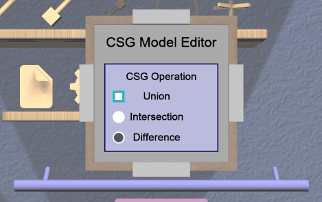
The CSG Tool Panel is a very simple panel that lets you change the CSG operation applied to all selected CSG models. Clicking any of the radio buttons applies the change immediately.
Extruded Tool Panel
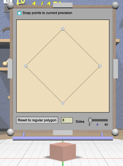
The Extruded Tool Panel lets you edit the profile that is extruded along the Z (up) axis for all selected Extruded models. The panel initially shows the current profile of the primary selection. Any changes to the profile are applied to all selected Extruded models; the models update in real time as the profile is edited.
Editing the Extruded Profile
Editing the profile for the Extruded models is essentially the same as in the Bevel Tool Panel, except that there are no fixed end points, the profile is closed, and there must always be at least 3 points to form a closed profile.
The checkbox at the top of the panel allows you to enable snapping of profile points to the current precision level. Note that this snapping is relative to the size of the selected Extruded model. For example if the current precision is 1 unit, a dragged profile point will be snapped in X to create 1 unit increments for the model at its current scale.
Setting the Profile to a Polygon
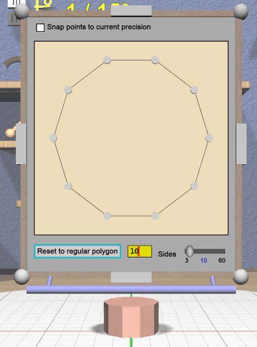
At the bottom of the panel is a button that lets you reset the extrusion profile to a regular polygon. The text input box and slider can be used to set the number of sides of the polygon. The slider ranges from 3 to 60, but the text input allows values up to 100. Clicking the button changes the current profile to a polygon. For example, this image shows the results of changing the profile to a polygon with 10 sides.
Import Tool Panel
The Import Tool Panel is essentially a File Panel that lets you specify the STL file to import or reimport the
mesh used for an Imported model. The model will be
changed to use the specified file when the Accept button is pressed.
Name Tool Panel
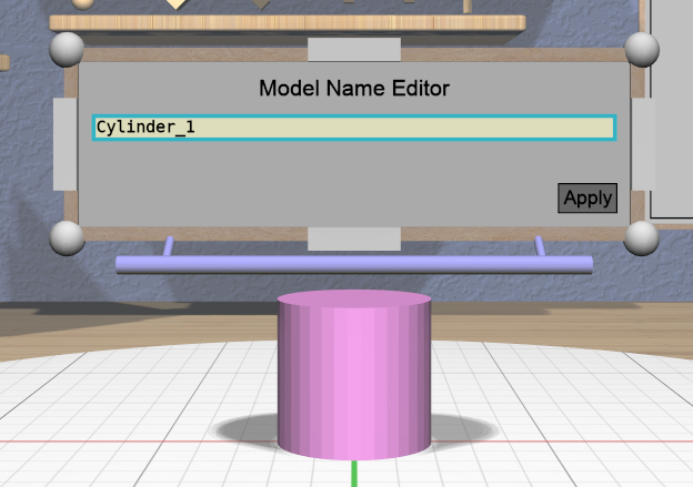
The Name Tool Panel is a very simple panel that is used by the
Name Tool to edit the name of the primary selection. The tool is activated when you apply the general Name
Tool action. The model’s name is updated whenever you hit
the Apply button.
RevSurf Tool Panel
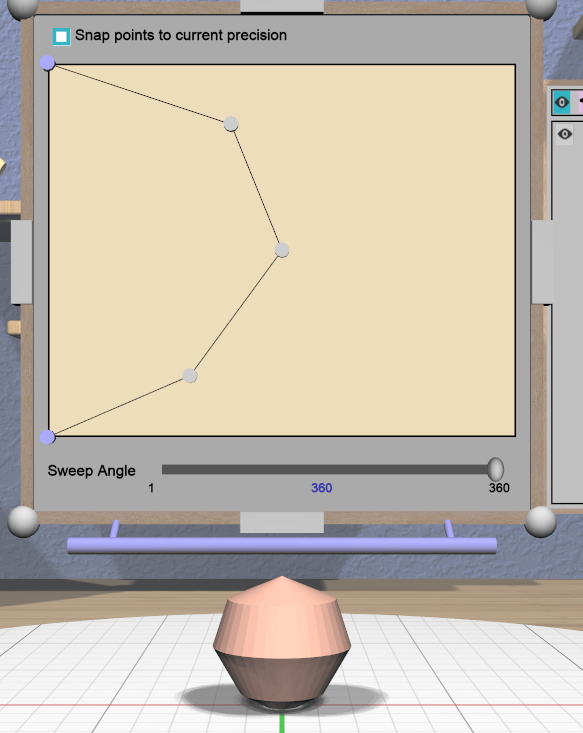
The RevSurf Tool Panel lets you edit the profile that is revolved around the Z (up) axis for all selected RevSurf (surface of revolution) models. The panel initially shows the current profile of the primary selection. Any changes to the profile are applied to all selected RevSurf models; the models update in real time as the profile is edited.
Editing the RevSurf Profile
Editing the profile for the RevSurf models is essentially the same as in the Bevel Tool Panel, except that there must always be at least 3 points in the profile; the panel will not let you delete an interior profile point if it is the only one left.
The checkbox at the top of the panel allows you to enable snapping of profile points to the current precision level. Note that this snapping is relative to the size of the selected RevSurf model. For example if the current precision is 1 unit, a dragged profile point will be snapped in X to create 1 unit increments for the model at its current scale.
Adjusting the Sweep Angle
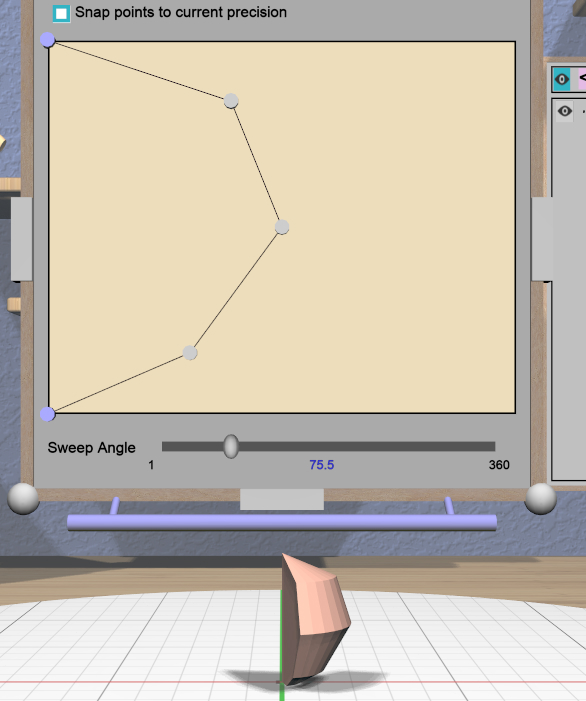
By default, a RevSurf model is created by revolving the profile 360 degrees around the Z (up) axis. You can change this with the slider at the bottom of the panel. Angles less than 360 result in a partial sweep with end cap polygons, as shown here.
Text Tool Panel

The Text Tool Panel lets you edit the text string, font, and
character spacing for all selected Text models.
The panel initially shows the values for the primary selection. Clicking the Apply button applies all changes made with
the panel to all selected Text models.
The panel lets you specify the following settings:
Text string.
Font name. The dropdown contains all available fonts.
Character spacing. The value of this slider multiplies the spacing between individual characters to move them closer together or further apart. The default is 1, which is the standard spacing defined by the font.
Tree Panel
The Tree Panel is the framed panel on the back wall. It has multiple uses:
Displaying a list of all models in the scene, including their tree structure and current status.
Selecting models.
Hiding and showing models.
Changing model order.
As mentioned previously, the Tree Panel is always visible in the same place, unlike other (movable) panels.
Session Name and Status
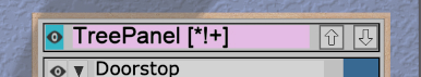
At the top of the Tree Panel is a row showing the current name of the session
being edited. If the session was not loaded from a file and has not yet been
saved with a name, it will show as <Untitled Session>. To the left is a way
to change the visibility of all models, as described below.
If the session has been modified since it was loaded or started, there will be a string of special characters within square brackets after the session name. This string may contain the following characters:
An asterisk (
*) indicates that one or more models has been created or modified and not undone.An exclamation point (
!) indicates that the session state (such as edge visibility or build volume visibility) has changed.A plus sign (
+) indicates that the commands in the session file have changed, usually by being undone.
All three characters are shown for the session in the above image.
Note that a session can only be saved to the same file if at least one of these symbols appears. For example, if you make changes to models and then undo back to their original state, there will be no asterisk, but the plus sign lets you know that the session can still be saved (because the sequence of commands has changed). The session state is also saved, so making changes to it allow you to save as well.
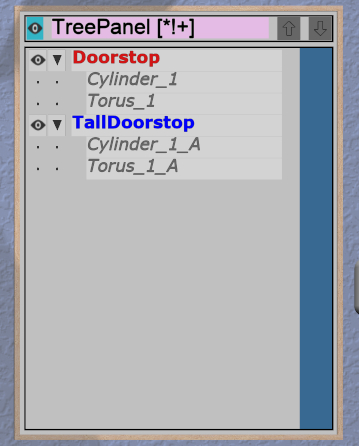
Model Names and Colors
Every row under the top row of the Tree Panel represents a top-level model in the scene along with its indented children, if it has any. If it has children, a triangle appears on the left (as shown in the above image) that you can click to collapse or expand the children.
The name of each model uses color-coded text to indicate its status:
The name of the primary selection is bold red.
The names of all secondary selections are bold blue.
The names of all models hidden because the visibility was turned off are purple and italic.
The names of all models hidden because some ancestor or descendent model is visible are gray and italic.
The names of all other models are black.
Changing Model Visibility
To the left of each top-level model name in the Tree Panel is a little eye icon. Clicking this icon toggles the visibility of the corresponding model in the scene.
There is also an eye icon next to the session name at the top. If any top-level model is currently hidden, clicking this will show all top-level models using the Show All action. Otherwise, it will hide all models.
Selecting Models

Clicking with the mouse (or pinch) on a model name in the Tree Panel selects that model as the primary selection. Modified-clicking on a model name toggles its selection status.
You can also use the mouse (or pinch) to drag out a rectangle withinin the panel. All model names intersected by the rectangle will be selected as shown here. Changing the order of model names may help in some cases to allow contiguous selections.
Note that you cannot have both a parent and child model in the same hierarchy selected at the same time. That would be bad.
Reordering Models
There are some rare cases where the order of models in the Tree Panel matters. One is when you want to use rectangle selection to select some set of models and they need to be listed consecutively. Another is when the order of children within a parent matters, such as within a CSG difference.
In these cases the two buttons to the right of the session name can be used to apply the Move Previous and Move Next actions, which move the primary selection up and down in the list. Note that if the primary selection is not a top-level model, it can only be moved up and down within its parent model.
These buttons are enabled only if there is a single model selected and it can be moved in the corresponding direction.